Context
DoorDash had plenty of rewards, but customers didn’t experience them as a system.
Credits, promos, and other benefits appeared across the app, email, and notifications. Customers regularly told support they “didn’t know they had a credit.”

The insight
We initially thought this was a discoverability problem. Mapping the experience showed something bigger:
The problem wasn’t finding rewards. It was understanding how they fit together.
How might we make DoorDash rewards feel like one connected loyalty program?
Research
I mapped where rewards appeared across DoorDash and how customers encountered them. Three findings shaped the product direction:
-
Fragmentation broke the mental model
Customers needed a durable home.
-
Timing mattered as much as discovery
Rewards also needed contextual surfaces.
-
A destination alone wouldn’t solve it
The product had to be a system.
Outside of notifications, there was no durable place to return to them.
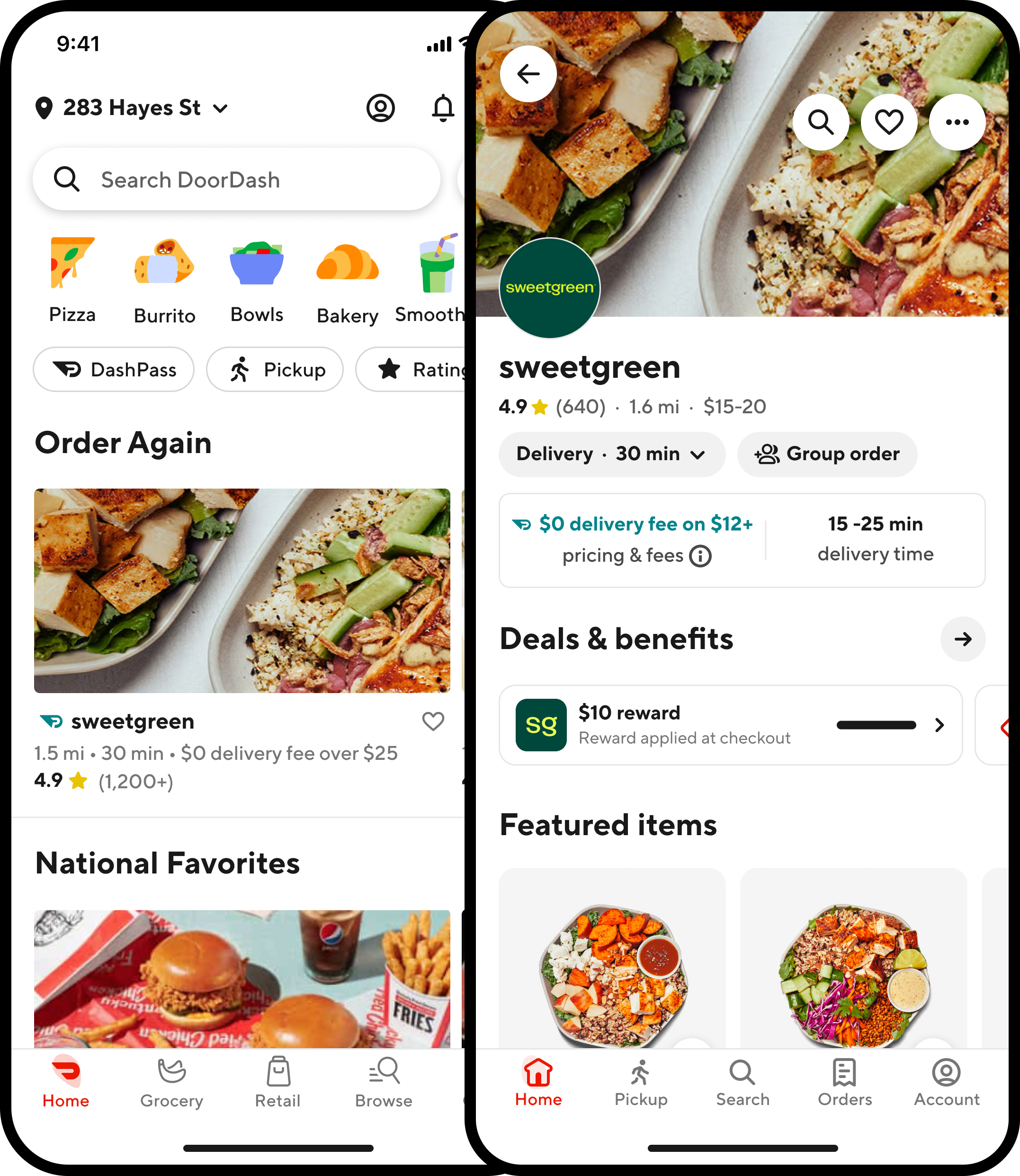
Customers had to return to the original store to see an earned reward again.
The issue wasn’t another missing entry point. Customers lacked a persistent mental model of what they owned.
The decision
The team’s instinct was to build a rewards hub: a place you go when you’re looking for something. I pushed for a wallet instead.
A hub is where you go when you’re looking for something. A wallet is something you already know is yours.
We also looked at leaning harder into contextual experiences alone: surfacing rewards only in the moment, without a durable home. That would have helped redemption, but it wouldn’t have solved the mental model. Customers still needed one place that made the program feel whole.
We killed the hub concept, converged on the wallet metaphor, and treated contextual entry points as part of the system — not a substitute for it.
I chose not to pursue three directions reviewers pushed for.
- Gamification (badges, streaks, tiers)
- Personalized recommendations inside the wallet
- Redesign of the checkout credit application
The wallet had to earn its keep as a surface first, not carry the weight of a full loyalty overhaul.
Finding the right shape
We explored a few ways to bring rewards together for all DoorDash customers, from a broader rewards hub to a more focused wallet. The hub could do more, but it also introduced more to navigate. We chose the wallet because it gave rewards a clear home without creating another destination customers had to learn.
Rewards hub
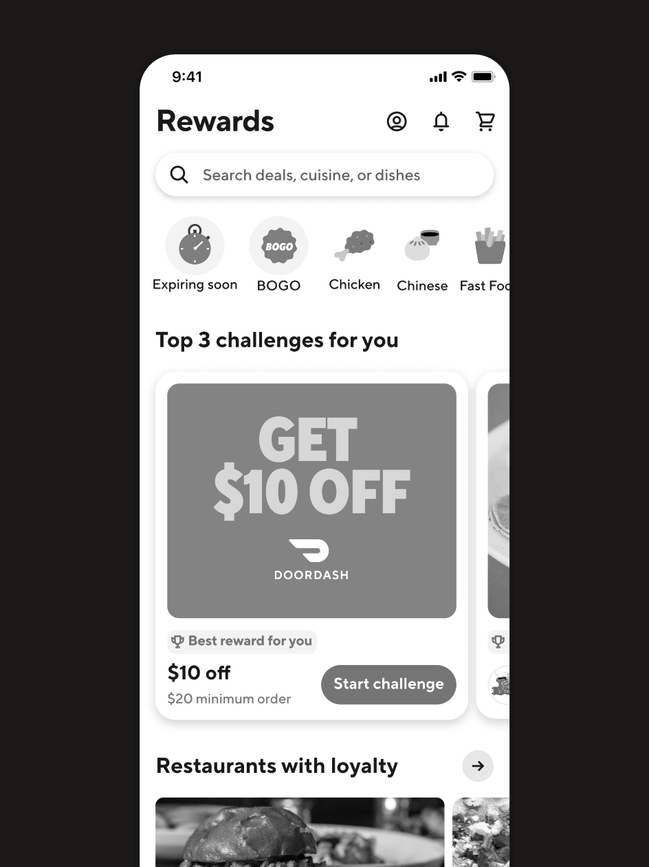
A broader destination for everything rewards — more capability, but another place customers had to learn and navigate.
Contextual rewards
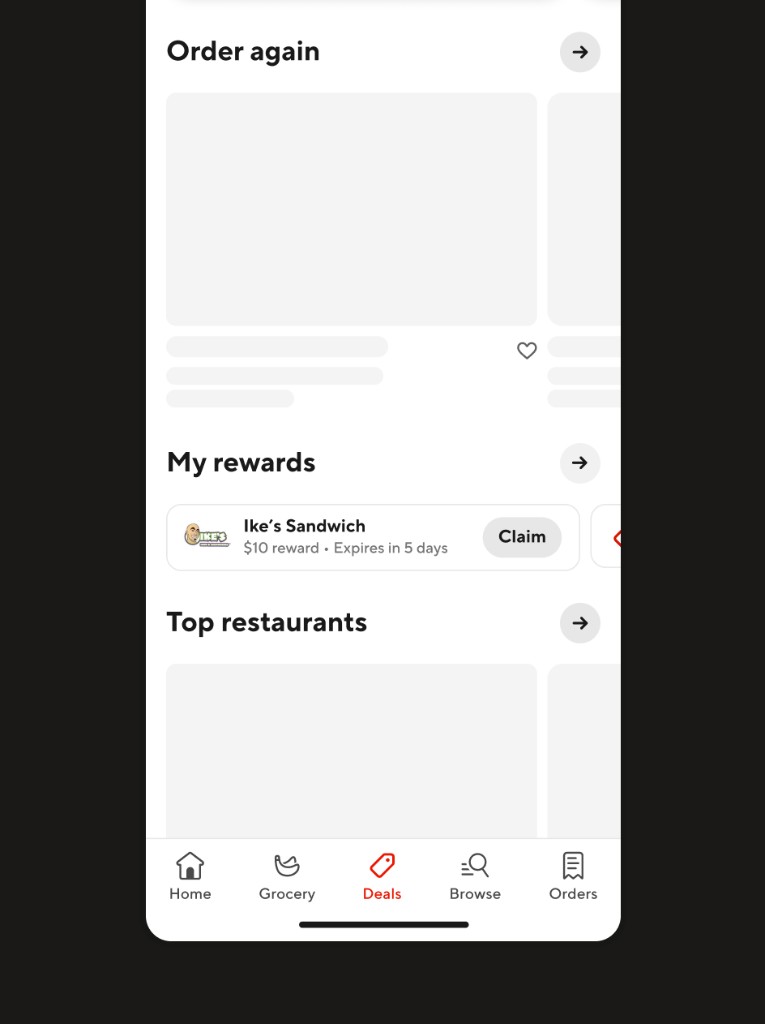
Rewards sprinkled through the shopping experience — homepage, storefronts, and other moments customers were already in.
Wallet + contextual surfaces
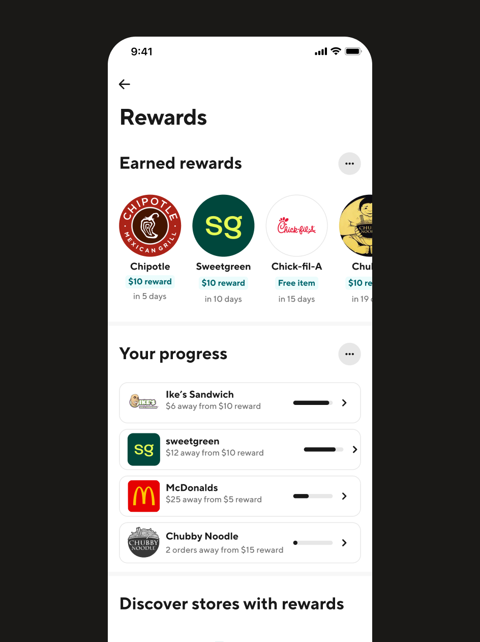
A clear home for rewards, plus surfaces in the moments customers were already in — the direction we chose.
The system
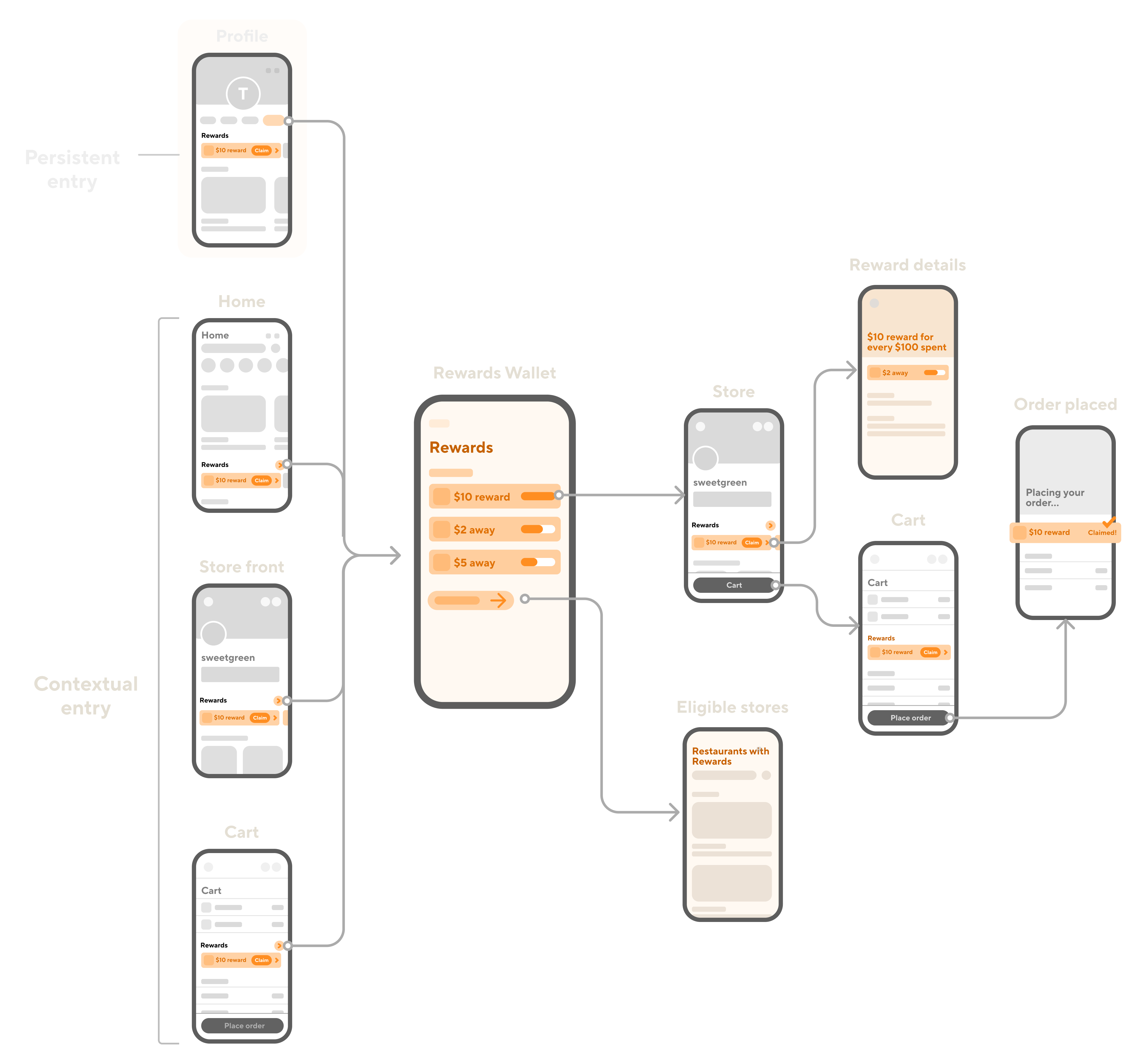
Three pieces had to work together: a durable home for rewards, contextual entry points throughout DoorDash, and a clear path from detail to redemption.
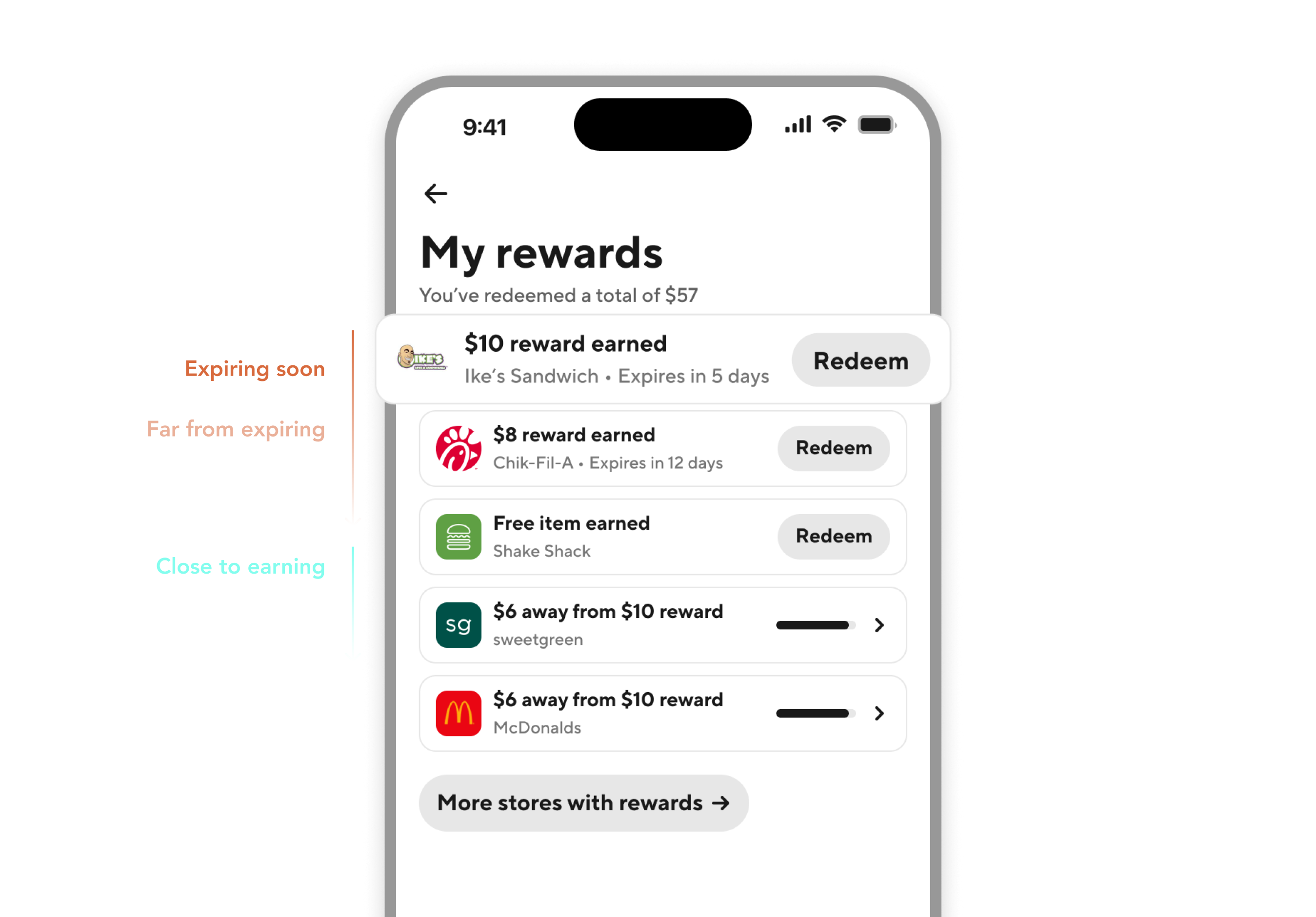
Wallet
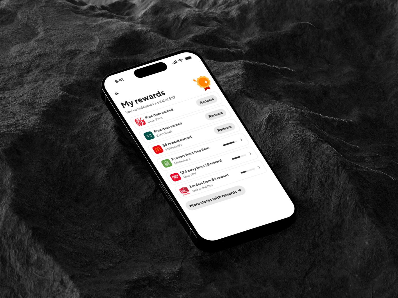
A single stacked surface that consolidated credits, promos, and other rewards into one scannable list — available to all DoorDash customers — with a card-shaped anchor at the top that reinforced ownership.
Redeem lands the benefit on the store page under Deals & benefits.
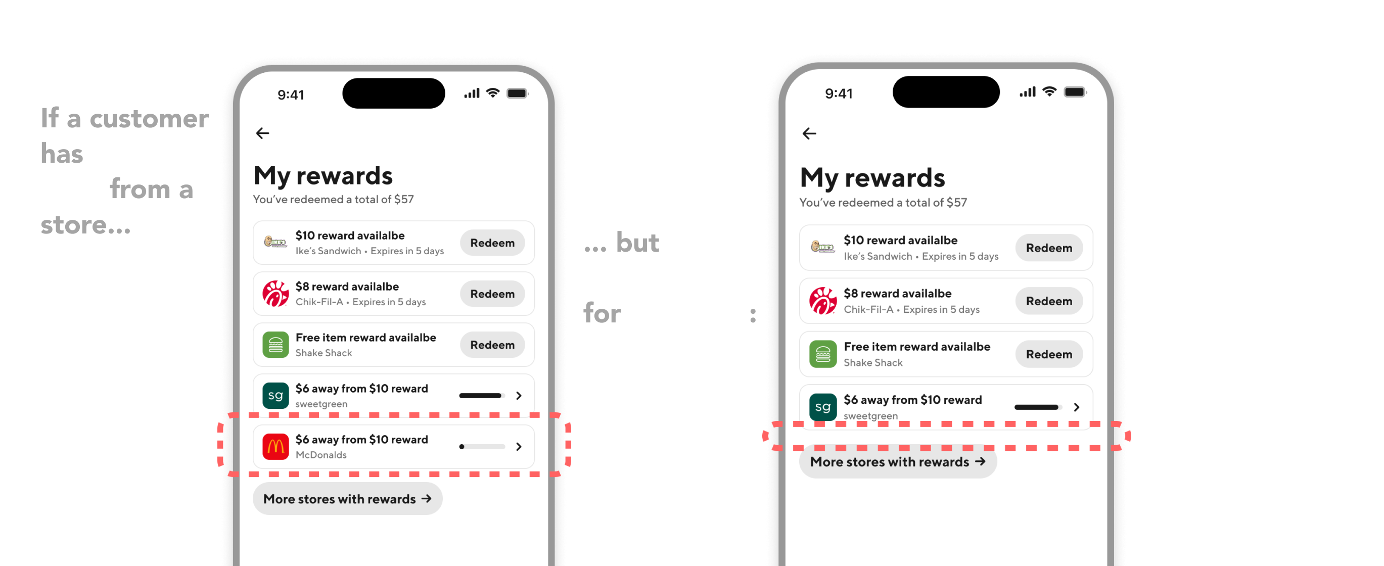
Rewards rise as expiration approaches; ties prioritize higher-value rewards.
Contextual entry points
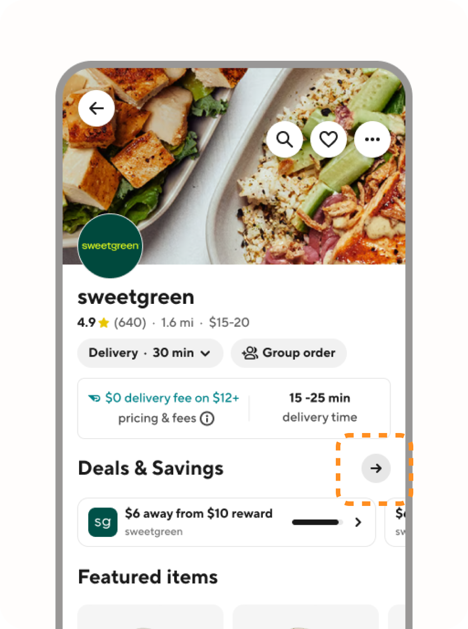
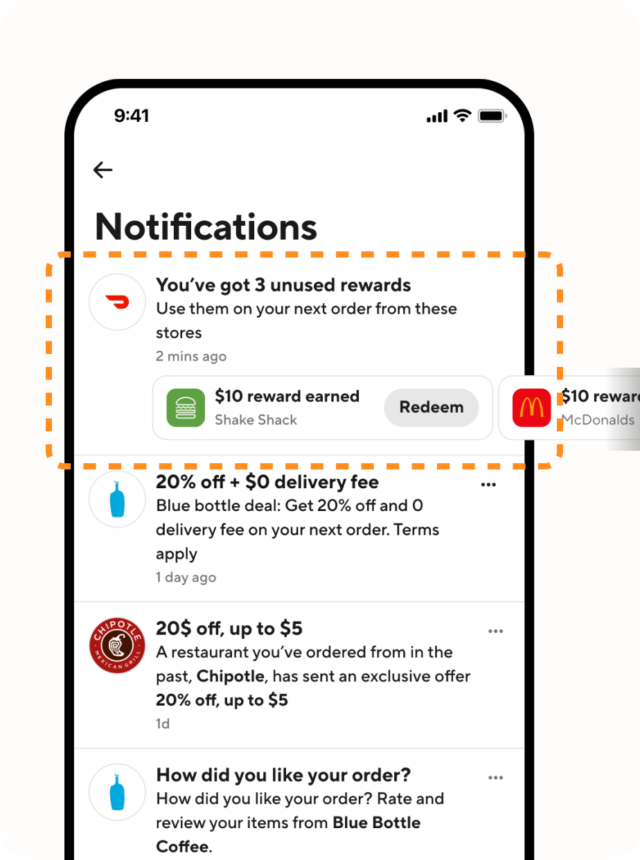
Rewards still needed to show up where customers were already making decisions — not only inside the wallet.
Account
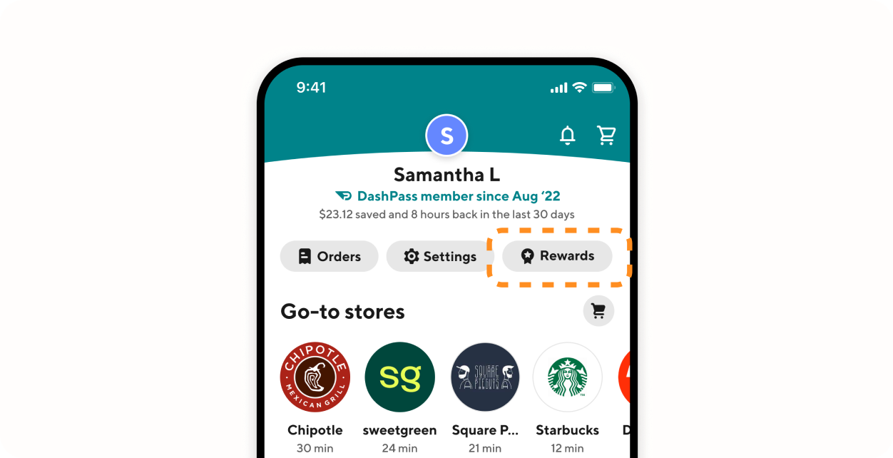
Home
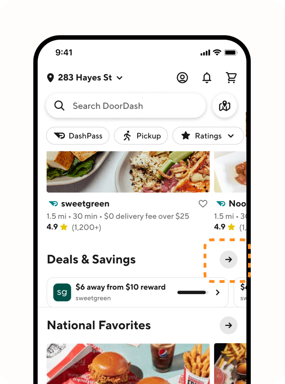
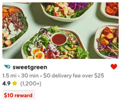
Store
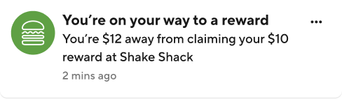
Notifications
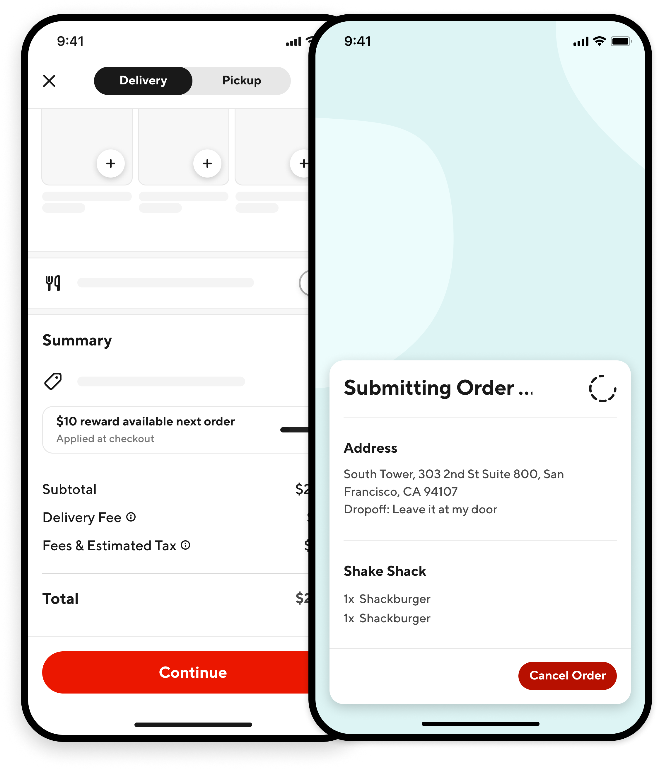
Reward details / redemption
Redeem had to feel continuous with the rest of DoorDash. From the wallet, customers could open a reward and land on the store page under Deals & benefits — close to the moment of ordering, not stranded in a separate loyalty flow.
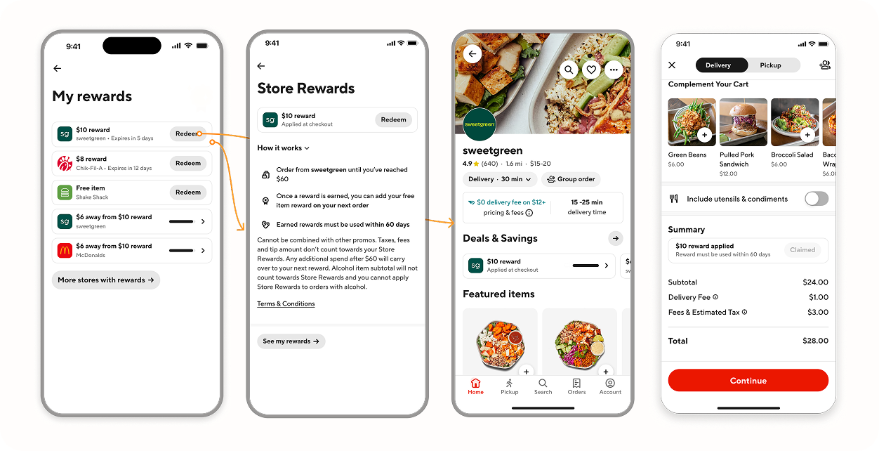
Redeem doesn’t apply the reward in isolation. It takes customers back into the shopping journey where the benefit can be used.
Outcome
$322K+
redeemed through the wallet during the initial launch
+0.51%
stat-sig savings lift observed in the launch experiment
During the initial launch, customers redeemed $322K+ in value through the Rewards Wallet. In the launch experiment, we saw a +0.51% statistically significant lift in savings. Post-launch NPS comments shifted from “didn’t know I had a credit” to “love that everything’s in one place.”
Reflection
The wallet solved the functional problem. It gave rewards a home.
Looking back, I’d spend more time on what happens after that. Once rewards are easy to find, how do you make them actually feel rewarding?
The next step wouldn’t necessarily be more mechanics. It would be finding small ways for the program to feel more personal, timely, and aware of what a customer values.
The wallet made loyalty easier to understand. I think the next opportunity was making it easier to feel.