Context
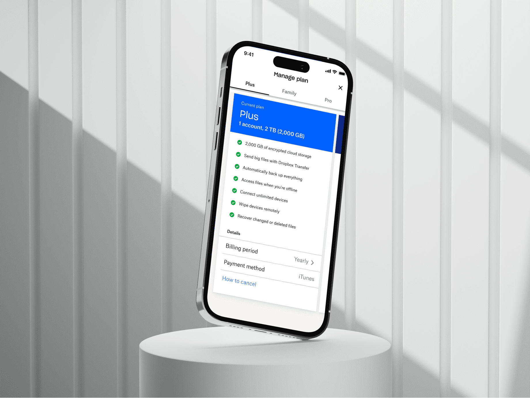
Dropbox had several plans with overlapping features, different limits, and increasingly complex ways of explaining them.
In our first round of research, 5 out of 5 participants struggled to explain the difference between the plans.
The problem wasn’t that we needed to show people more information. We needed to make the information we already had easier to compare.
Approach
I reframed the problem in one sentence: the page was optimized for feature comparison, but people were shopping for a fit.
They weren’t asking, “Does this plan have version history?” They were trying to figure out, “Which one is actually for me?”
That led to three changes:
-
Organize around how people choose.
Instead of leading with features, we gave each plan a clearer use case. The feature list was still there, but it became supporting information rather than the starting point.
-
Show less, so the differences stood out.
Research showed that many of the comparison rows weren’t influencing people’s decisions. We removed about 40% from the default view and kept the full comparison available for people who wanted the detail.
-
Write the experience while designing it.
A lot of the confusion came down to how we explained the plans, not just how we laid them out. I brought PMM into the design process earlier so we could work through the hierarchy and language together instead of treating copy as a final step.
What we didn’t build
We explored an interactive plan-picker, but it added another step between people and the information they were looking for.
This was a comprehension problem, not a persuasion problem.
Finding the differences that mattered
Before changing the UI, we had to decide what information deserved to be compared in the first place.
We grouped features around the questions customers were actually trying to answer: How much storage do I get? Who can use it? What happens if something goes wrong? What do I get by upgrading?
Image coming soon
Simplified categorization / IA — features grouped by customer question
Comparison table or guided choice?
We explored making plan selection more guided, but that introduced another layer between customers and the information they were already looking for.
Instead, we kept comparison direct and focused on making the differences between plans easier to scan.
Early direction
Why it didn’t work
Final direction
Making comparison actually feel like comparison
Image coming soon
Previous Dropbox plan comparison
Features were comprehensive, but the hierarchy made every plan feel similar.
Image coming soon
Final plan comparison design
We reorganized features around customer needs, surfaced meaningful differences earlier, and made it easier to scan across plans without reading every row.
Testing it again
Same tasks and questions as the initial research: What is different between these plans? Which one would you choose? Why?
Before
0/5
confidently distinguished plans
After
4/5
correctly identified the differences
Outcome
Comprehension in follow-up testing improved decisively: users could articulate plan differences without prompting, where five of five previously could not. Downstream, the redesigned page contributed to a lift in self-serve conversion on the page (specific numbers under NDA).
Reflection
Looking back, the biggest lesson wasn’t about comparison tables. It was how easy it is to treat an information problem like an interface problem.
The UI got simpler because we first got clearer about what customers actually needed to understand.